
Pods
A platform that helps users convert different sources into audio-based podcasts

ROLE
UX Designer
TEAMMATES
Thomas Emnetu, Yaphet Paulos, Kelly Chang, Caleb Lee
TOOL
Figma/ Miro
DURATION
October 2024 - December 2024
— THE PROBLEM (from the pov as a college student)
Learners are overwhelmed with text-heavy materials that are hard to process on the go or during multitasking
Let's take a sneak peek into the 3 designs of Pods
For this project, my goal is providing users a seamless experience in managing and utilizing materials efficiently and systematically, helping them save time and boost productivity.


01. DISCOVERY

02. IDEATE
— SURVEY INTAKE
03. DEFINE
01. DISCOVERY
04. DESIGN & ITERATE
I realized there were much more students out there were also struggling with this problem just like me.


Engaging with the materials through AI-generated flashcards
While waiting for the podcast to be generated, users can engage with the materials by studying flashcards.
Enhancing personalization though audio customization
Empower users to create podcasts that feel truly their own.
A survey (n=50) was sent out as a type of Google form, targeting college/ master/ and PhD students to gather data on what difficulties that they mostly find when study and to seek for references about features they want to see in a new study helper platform.

— USER PERSONA
Leveraging insights from the survey, I crafted 2 Behavioral personas, representing my targeted audiences.
They are all busy individuals with a heavy load of reading to process and comprehend. A common challenge they face is struggling with text-heavy materials, making it difficult to absorb information efficiently. As a result, their goal is to improve their ability to process dense texts more proficiently while multitasking to save time.

Lily Ng - The passionate PhD Student, would like to minimize time in reading articles and doing her research

Edward White - That One Tenure CS Professor, likes to keep up with all the new breakthroughs
— BRAINSTORMING SOLUTIONS
02. IDEATE
Many solutions that I considered to be feasible to take in action in order to solve the current issue such as creating a platform that converts articles to comic-based or game-based while users can both entertainment through puzzle games but still can observe contents from the articles by listening to the articles that already been converted to audio file.

Considering between 12 actionable ideas WAS a challenging decision!
— CRITIQUE
Lack of Customization to user needs, such as personalized audio summaries

1.
— MY SOLUTION
Recent Space: Managing audio file into each category
Each category and subject is easily managed and viewed.

Accessibility
I think I have found a solution!
After receiving insightful feedbacks from my peers, I did some secondary research about the feasibility and possibility of implementing this chosen idea. Surprisingly, there are many reliable researches show the strong potential future of audio learning.
“Sound can help people retain information, connect words with facts or visualizations, and be a simple and effective way to obtain and retain information.”
Learners can easily consume educational content while on the go, making knowledge is available to everyone
Creating a platform that helps users convert different sources into audio-based podcasts.
— COMPETITIVE ANALYSIS
Some aspects that I find NotebookLM falls short.
NotebookLM is an AI tool developed by Google to help users generate audio files and interact with them by uploading their documents. NotebookLM also does quite of the same thing with our intended goal but there are some features that I find they are lacking of.


Limited flexibility in adapting to diverse learning styles

No seamless integration for creating user-specific content formats

05. VALIDATE
So… What makes my product stand out?
— UNIQUE SELLING POINTS
Granular Inputs for Personalization
Users can enhance controls over the audio outputs
Users can refine preferences before generating the podcast
My product is designed to give users complete control over your audio experience. Users have full control over their audio experience, from fine-tuning preferences before generating a podcast to adjusting the tone, length, and even the number of hosts. It’s all about creating content that feels uniquely yours!
Customization Features
Edit the length of audio summaries
Adjust the tone (formal/ conversational)
Choose the number of hosts
Empowering users to create podcasts that truly feel their own
Personalization
Empowers users to customize content to match their unique needs such as fine tuning/ audio length/ accents
— MY VISION

With this comprehensive vision, I expect to see this platforms could make reading experience of everyone become more accessible and easier. At Pods, I am committed to creating a platform where all users can engage with content in a way that feels intuitive and efficient. By listening to our users, I continuously improve and innovate, shaping a more inclusive digital world where everyone has the opportunity to enjoy content on their terms.

AI-powered
Enhances learning efficiency with AI-powered audio summaries and flashcards
Inspired by Google NotebookLM, I came up with the user flow for the main page of Pods - Creating new Podcasts
— SIMPLIFIED USER FLOW
To create a seamless and user-friendly platform that even low-tech users can navigate with ease, I have simplified the user flow to just four essential steps while maintaining full functionality. Highlighted to the main feature of creating a new podcast, users will upload all of the desired sources to be referenced, prompt the AI model with additional context of what you’d like the podcast to focus on and highlight and generate.


04. DESIGN & ITERATE
I continued to develop a full information architecture of Pods
— INFORMATION ARCHITECTURE
Enhancing from not only letting users adding additional prompts after the customization step, my product also allows users to do many fine tuning features to create the most personalized version of users’ podcasts. Moreover, since “Existing Podcasts” and “Create new Podcasts” are the two main sections that users utilize within the app so I have added a shortcut making the navigation process between those two pages becomes more seamlessly and easily.
Core screen #1: Home Dashboard
The homepage provides users with an organized overview of their audio content, allowing quick access to pinned and recent items, as well as customizable categories that group projects and podcasts for easy navigation and content management.
— WIREFRAMES
↪ Design Details on v.2
↪ Pod Creation v.1

03. DEFINE

Core screen #2: Create a New Pod
This screen allows a user to input any type of source for the podcast, and receive real-time recommendations on additional helpful sources to potential add.
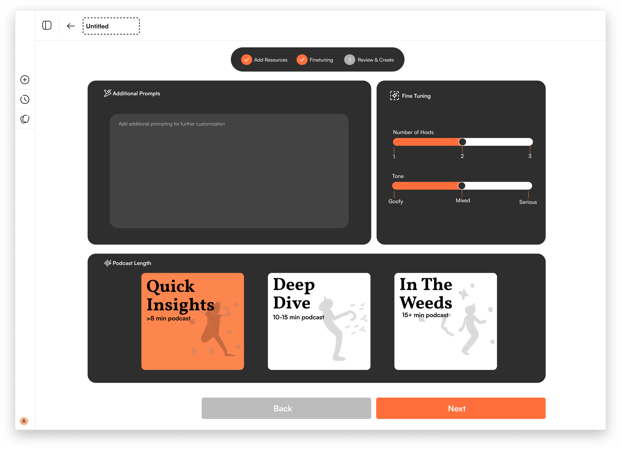
Core screen #3: Customization
This page builds upon the prior uploaded files by offering more granular customization inputs for the user before the confirm their preferences and generate the podcast.

↪ Customization v.1

↪ Design Details on v.2

↪ Latency 3
↪ Customization v.2

Core screen #4: Latency Page
This screen shows the progress of AI generating the podcast and a set of flashcard that are contextualized to the uploaded sources for users to interact with.
↪ Latency 1
↪ Latency 2

↪ Latency 4

ITERATE

↪ Homepage v.1
"I see this tool as a study helper, similar to ChatGPT or QuillBot, so adding this feature to the platform feels a bit unnecessary to me."


↪ Homepage v.2

↪ Pod Creation v.2
↪ Design Details on v.2

Users respond that the streak system is unnecessary.
Usability Testing
Testing between 2 versions was conducted both in-person and remotely over Zoom with mostly local Washington students. I was able to gather thoughts and interactions of participants through these 2 highlighted feedback.
— USER TESTING + ITERATIONS
"I feel like I'd get really stressed out if I had to study every single day just to keep the streak going."
“I think I won’t care about the streak feature. ”


05. VALIDATE
2.
↪ Version 1
↪ Version 2
✓

During the audio customization process, users responded that the fine tuning design was dense.
"The space for the fine-tuning option feels quite small, making it hard for me to click on each one."
"Maybe making a back button bigger or darker would be great. "
“Do you think there are too many features for fine tuning? Personally, I see they are designed too dense.”
FINAL DESIGNS


From this project, I learnt meaningful lessons:
3.
Initial logo was changed to match the overall theme.
Limiting the navigation bar on homepage to only 3 sections “Create a podcast”, “Recent Pods”, “Spaces” - helping users easily manage their materials.
“Recent Pods” only contained list of generated podcasts.
Allowing users to upload different types of sources at the same time up to 50 sources.
Refining the back button on Fine tuning step to look more clear.
Reducing the fine tuning options to the 2 most used features.
Showing captions side by sides with the generated podcasts.
3-step bar was newly added so that users can easily keep track the process.

Not always more is better
Initially, I thought offering many customization features would help users tailor their podcasts. However, too many options might overwhelm them, making choices harder and the design less user-friendly.
Adapt to necessary changes
With so 2 design versions, I have received so many valuable insights from user testing. Adapting to necessary changes makes the final designs become inclusive and accessible that better match users’ needs.
Align goals throughout the process
Keeping in mind of creating a platform that boost user customization helps me always stay on track and come up with as much features that cater user’s needs as possible.
↪ OTHER UX PROJECTS

An AI-powered platform connects users with organizations and events that suit their needs
UX Research
Headway Awards
UX Design
Viettel Digital
Designing a new service for Viettel Money app, car-renting features
Internship
UX Design
