ROLE
Product Design Intern
PROJECT
Viettel Money - a comprehensive financial app that consolidates multiple services
TOOL
Figma
DURATION
June, 2024 - August, 2024
THE PROBLEM SCOPE
Integrating a car renting service
into Viettel Money app - offering a diverse selection of vehicles for short-term rentals at competitive costs
OBJECTIVES
Encouraging customers using money flow
in Viettel Money rather than relying on other external sources or banks
I conducted a competitive analysis of two leading car-renting apps in Vietnam: Traveloka and MoMo
My approach began by experiencing each app firsthand, walking through all the steps and services offered. I conducted a SWOT Analysis to provide a comprehensive view of the subject's competitive positioning.
Traveloka

Momo

HOW MIGHT WE?
How might we enhance customer services so that users can be assisted in any situations?
HOW MIGHT WE?
How might we simplify and visually prioritize critical information on the transaction page to help users avoid missing any terms?
HOW MIGHT WE?
How might we redesign the filtering interface to be more organized so users can quickly find vehicles that match their needs?

SOLUTION 1

Dual-layer filtering system
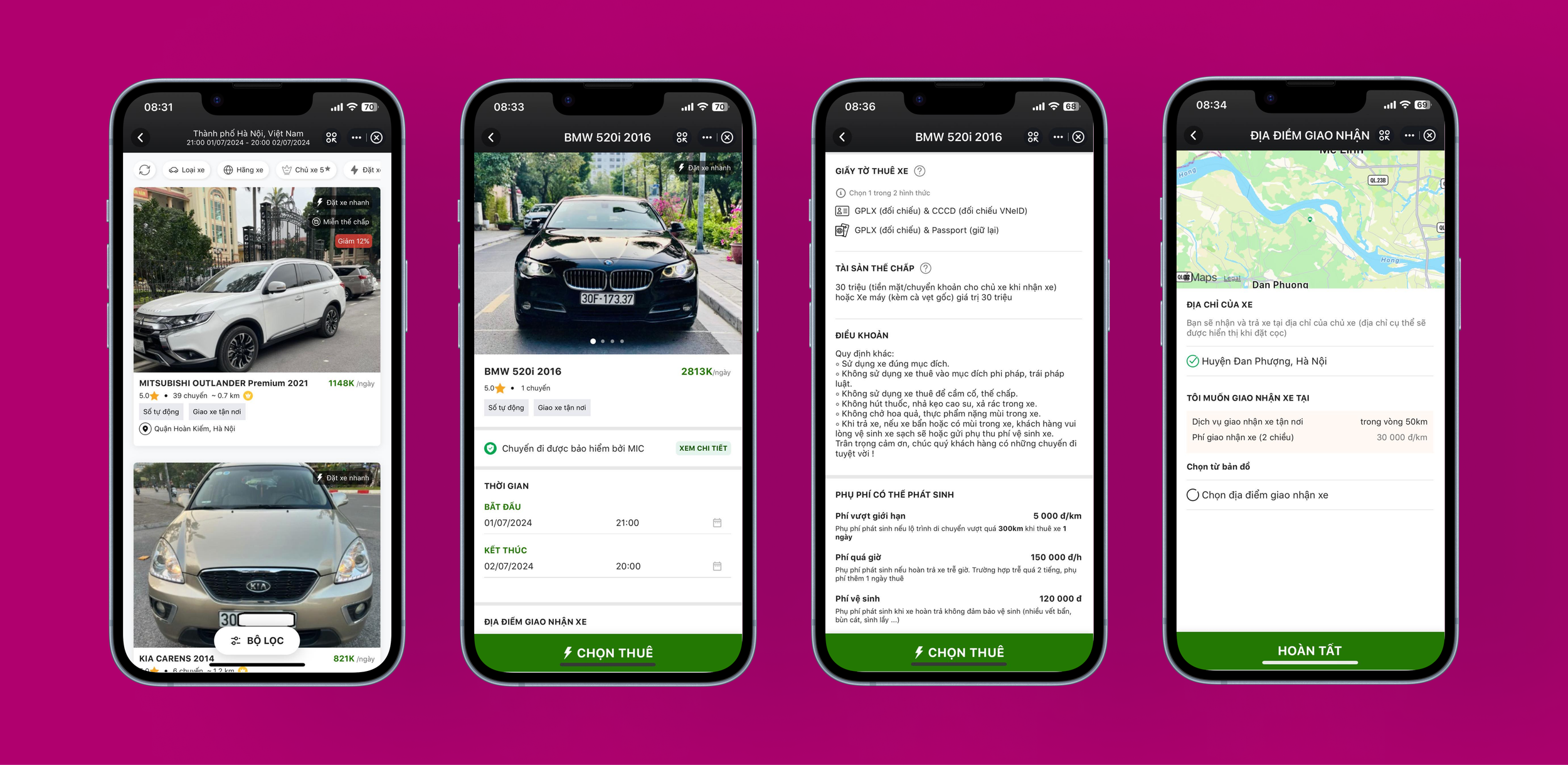
The detailed filtering system includes a wide range of options, such as car motion type, energy type (e.g., electric, gas), passenger capacity, brand, price range, and car type. This diverse selection empowers users to choose a vehicle that aligns perfectly with their preferences and specific requirements in various circumstances.


— UNDERSTAND THE MARKET
I interviewed Mr. Vu Dao, General Director of Viettel Digital to have more insights about target users, operational challenges, and align my UX strategy with the company's business goals.

Step 5: Make a payment

Interviewed the General Director of Viettel Digital
— UNDERSTAND THE STAKEHOLDER
I utilized HMWs to open up the user pain points for capable approach for ideating solutions.
Traveloka and Momo struggled to develop smooth and intuitive mobile applications, which lead to steep learning curves that affect customer retention and conversion. In order to direct Viettel Money's design emphasis, I determined three main user pain points and created the following "How might we" questions to come up with the feasible solutions.
PAIN POINT 1
Users struggle to get the assistance they need.
PAIN POINT 2
Users feel overwhelmed by the amount of information on the transaction page - rental terms, insurances, confirmation.

PAIN POINT 3
Users find it hard to select their preferred choices because of the app’s unorganized filtering sections.
“Simple design that is accessible to all users including young and older users (up to 60 years old). Letting the users use the money that they have already transfered into Viettel Money instead of linking with other banks.”
Step 1: Choose Location, Time, and Date

— USER PAIN POINTS
SOLUTION 1
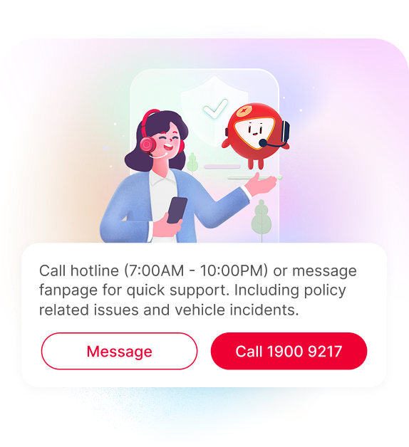
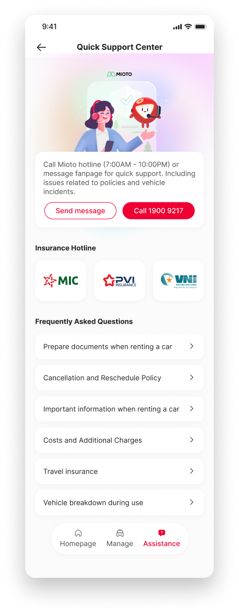
“Quick Support Center” Feature
To enhance customer assistance, I designed a new "Quick Support Center" feature. This feature provides users with three primary support options:
• Hotline Support – Available daily from 7:00 AM to 10:00 PM
• Messaging Support – For more flexible communication
• Hotline to the car insurances
Additionally, a comprehensive FAQ section addresses commonly asked questions, enabling users to quickly resolve general queries without needing to contact support directly.
I created a seamless 5-step user flow
Inspired by the standard user flow that current car-renting platforms utilize right now, my finalized user flow has been optimized to five steps and incorporated a driver license verification step for enhancing auditing.
Step 2: Choose the car

Step 3: Confirm the car


% Users achieved the right result
90% (9 participants)
— USER FLOW
— LOW FIDELITY PROTOTYPE

Based on the first three steps, I identified three potential drop-off points in the user journey. The first occurs when users search for a location that isn’t available, requiring them to select an alternative. The other two happen when the system lacks the desired car type, causing users to exit the process without completing the rental.
% Users associate the correct action with the effect they are trying to achieve
70% saying “Yes” - They figured out the right button at step 2
30% saying “No” - They passed the page that has the filtering options and had be return to step 2 page (1 participant quitted)
Users Feedback
Filter icon is placed too low on the page
Do not notice there is an icon for filters on step 2
1. Add Filter Options on the top and Rename to “Filter”
I added common filter options at the top of Step 2 and renamed “Sort By” to “Filter” for better clarity.
→
% Users associate the correct action with the effect they are trying to achieve
30% saying “Yes” - They adjusted during step 2 using the pen icon
70% saying “No” - They intended to adjust during step 3 by clicking into the calendar but ended up they could not change by doing that
(3 participants managed to go back to step 2 while other 4 participants still did not figure out how to do the task)
% Users achieved the right result
60% (6 participants)


→
Pros
Traveloka’s design is clean and intuitive, making it easy to reach the golden path each step by step.
Cons
Pros
Momo provides the real-life condition images of the car, enhancing credibility with users. Moreover, it displays attractive locations sorted by each province so customers can have preferences.
Cons
Rental terms and other conditions in the transaction page are dense without any highlighted key points.
Lack of filtering options which might not target to each customers’ needs. Moreover, there are few options for customers seeking for assistance.
01. DISCOVERY
Understand business objectives and product requirements
For me, thoroughly understanding the product requirements at the beginning is one of the most crucial parts of the design thinking process. It sets a clear direction, allowing me to deliver the best product quality for the business and users.
02. DEFINE
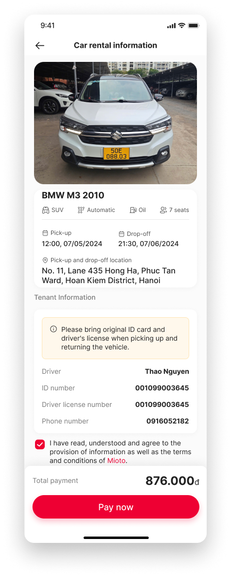
Step 4: Fill in personal information
Empathize and “listen” to user needs
For me, thoroughly understanding the product requirements at the beginning is one of the most crucial parts of the design thinking process. It sets a clear direction, allowing me to deliver the best product quality for the business and users.
— SOLUTION
03. PROTOTYPE
Design an intuitive mobile app experience
For me, thoroughly understanding the product requirements at the beginning is one of the most crucial parts of the design thinking process. It sets a clear direction, allowing me to deliver the best product quality for the business and users.
Through interview with 3 types of targeted audiences, I gathered valid insights about their needs.
To align with the stakeholder's requirement of creating an accessible platform that is easy to use for all customers, including older adults, I conducted research on three target audience groups. This helped me gain deeper insights into their experiences and perspectives with two existing platforms currently available in the market.

— UNDERSTAND THE CUSTOMERS
After deeply considering what customers truly want for a car-renting service, accessible intuitive designs have been made to target all users’ needs.
Solutions to address user’s pain points

SOLUTION 2
Streamlined Transaction Page
To improve the user experience on the transaction page, I structured the information into clearly defined categories:
Car rental policies
• Rental requirements
• Important notices
• Change/cancellation policies
• Potential additional fees
Each category is presented in a dedicated section, ensuring users can easily locate relevant information. Key details are displayed in concise bullet points, highlighting the most critical aspects for quick and efficient comprehension.
This is a version after the 6th iteration
Inspired by the standard user flow that current car-renting platforms utilize right now, my finalized user flow has been optimized to five steps and incorporated a driver license verification step for enhancing auditing.
— Wireframes
04. USER TESTING + ITERATION
Cognitive walkthrough and design improvements
I conducted cognitive walkthrough with 10 participants, assigning them two main tasks. Through this user testing, I identified design elements that caused friction in the user experience. Using these insights, I refined key app features to enhance usability and improve overall user satisfaction.
Rent an electric car priced above 1 million VND

— Task 1
Change renting date in the middle of the process

— Task 2
Users Feedback
Confusion of icon for changing date
Availability to adjust date at step 3
I informed 2 design decisions based on customers’ feedback

Synthesizing user feedbacks and their experiences within the app, I iterated my initial designs to help users go directly on their golden path. Here are my design improvements:
— Iteration
Identified potential edge cases users might face during the rental process
Following the standard user flow, I mapped out the task flows for renting a car, from accessing the app to completing the payment. These flows outline how different tasks are connected throughout the rental process, knowing which part users may quit or encounter difficulties.

— USER FLOW INTERACTION
The major edge cases users may encounter during the final two tasks involve the ability to modify their location or time selection and ensuring their personal information is entered correctly.
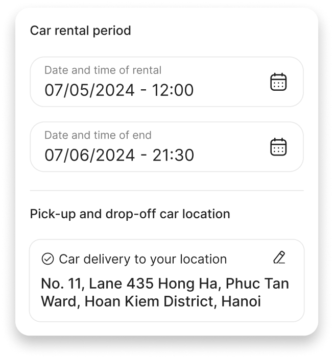
2. Allow users to adjust rental date and location
Users want a quicker way to adjust their rental date and location without having to go back to Step 1 or Step 2. To address this, I integrated a feature that allows them to modify the date and location directly in Step 3.
05. FINAL DESIGN
Being mindful with UI design
Building on the existing design system of the Viettel Money app, I focused on creating a visually intuitive and user-friendly interface. My goal was to ensure accessibility for all users, including older adults, aligning with stakeholder requirements.
APP LOADING & HOMEPAGE


CAR RENTING PROCESS


TRANSACTION STATUS

CAR RENTING MANAGEMENT & HOTLINE


Now, users are able to view important policies all in one place
I provided an expandable section for each policy section, so users can open/close them as needed.
This clean UI helps users easily view and still get the key information on the default view mode.
Users easily rent a car with just a few click
I provided an expandable section for each policy section, so users can open/close them as needed.
This clean UI helps users easily view and still get the key information on the default view mode.
Key takeaways
Since this was my first internship project, I found myself truly enjoying the process of ideating, designing, and conducting user usability testing. Here are my 3 major takeaways:
1.
Communicate well with different teams
Learn how to communicate my design decisions clearly with Product Managers, Engineers, and other stakeholders.
2.
Decisions need to be based on reality
I found out that instead of designing an app intuitively, my designs need to be based on what users truly wants, needs through deploying user interview and usability testing.
3.
Shortcuts accelerate user decision-making
In real life, users often reconsider their choices or seek better alternatives. Providing shortcuts to key actions without having to return to previous steps ensures a more flexible and streamlined experience.
↪ OTHER UX PROJECTS

An AI-powered platform connects users with organizations and events that suit their needs
UX Research
Headway Awards
UX Design
A platform that helps users convert different sources into audio-based podcasts
Case Study
Product Design
